Illustrations in Commercial Use -
Glow Skincare
Illustrations in Commercial Use -
Glow Skincare


Feminine, ethereal, and elegant packaging design done in an illustrated approach, and inspired by Art Nouveau and mythology.
This is my Bachelor's project, which combines illustrated brand storytelling with a structurally considered packaging system designed to reduce waste and encourage long-term use.
I was responsible for the entire process: concept development, brand strategy, visual identity, packaging system design, 3D visualisation, video simulation, and exhibition.


Problem
Skincare packaging is often designed for short-term visual impact. Despite high production value, most packaging is disposed of immediately after purchase.
The central question of this project was: How can packaging maintain aesthetic desirability while actively encouraging reuse and reducing waste?
The goal was to design a system that: creates emotional attachment, extends product lifecycle beyond first use, balances sustainability with brand desirability, functions in a realistic commercial setting.
Outcome
The final result is a brand and packaging system that functions beyond decoration. It demonstrates how illustration, sustainability, and commercial viability can operate within a single structured design system.
This project fundamentally shaped my approach to design: aesthetic decisions must support functional intention. Emotion and structure are not opposites, they strengthen each other when aligned.
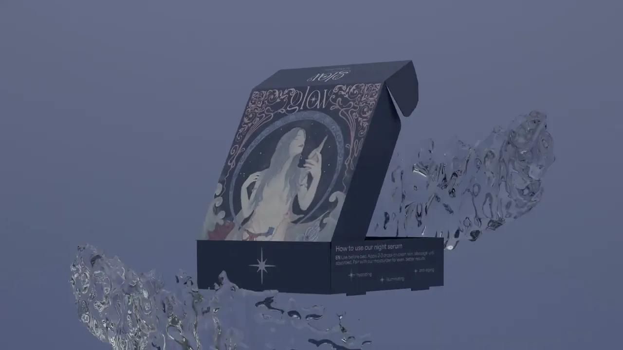
Concept & Brand Narrative
The brand illustrations are inspired by Romanian folklore fairies known as “iele”, mythical figures associated with nature and atmospheric elements.
Instead of using folklore purely decoratively, I translated it into a strategic visual framework. Water was chosen as the primary motif to reinforce hydration as a core product benefit. Flowing Art Nouveau structures were used to visually connect nature, femininity, and fluidity. Illustration became both narrative device and functional packaging surface. The ethereal aesthetic is intended to support brand differentiation in a saturated skincare market while maintaining clarity and legibility.
Packaging System
The system includes: two serums (day and night) in individually illustrated boxes, a combined product pack, reusable etched glass bottles, refill pouches to extend lifecycle, 3D mock-ups and a commercial simulation video, exhibition display demonstrating real-world presentation.
Rather than designing isolated packaging pieces, the objective was to create a coherent modular system.
Sustainability Strategy
Sustainability was not treated as a visual trend, but as a structural design decision. The intention was to shift packaging perception from disposable to reusable.
Key measures included: durable glass bottles with etched branding to avoid additional labels, refill pouches to reduce material consumption over time, recycled cardboard for outer packaging, potential use of eco-friendly inks, reduction of unnecessary adhesive components.
Design Approach Summary
The project followed an iterative development process:
Research & Benchmarking: analysis of existing skincare packaging systems and evaluation of material durability and reuse potential.
Visual Development: illustration system development inspired by folklore motifs and colour palette refinement to balance femininity and clarity
Commercial Simulation and testing: packaging construction prototypes, 3D modelling for realistic presentation, short promotional video to test brand viability.


Sound design by Oliver Chakra.


Feminine, ethereal, and elegant packaging design done in an illustrated approach, and inspired by Art Nouveau and mythology.
This is my Bachelor's project, which combines illustrated brand storytelling with a structurally considered packaging system designed to reduce waste and encourage long-term use.
I was responsible for the entire process: concept development, brand strategy, visual identity, packaging system design, 3D visualisation, video simulation, and exhibition.
Illustrations in Commercial Use -
Glow Skincare
Problem
Skincare packaging is often designed for short-term visual impact. Despite high production value, most packaging is disposed of immediately after purchase.
The central question of this project was: How can packaging maintain aesthetic desirability while actively encouraging reuse and reducing waste?
The goal was to design a system that: creates emotional attachment, extends product lifecycle beyond first use, balances sustainability with brand desirability, functions in a realistic commercial setting.
Concept & Brand Narrative
The brand illustrations are inspired by Romanian folklore fairies known as “iele”, mythical figures associated with nature and atmospheric elements.
Instead of using folklore purely decoratively, I translated it into a strategic visual framework. Water was chosen as the primary motif to reinforce hydration as a core product benefit. Flowing Art Nouveau structures were used to visually connect nature, femininity, and fluidity. Illustration became both narrative device and functional packaging surface. The ethereal aesthetic is intended to support brand differentiation in a saturated skincare market while maintaining clarity and legibility.
Packaging System
The system includes: two serums (day and night) in individually illustrated boxes, a combined product pack, reusable etched glass bottles, refill pouches to extend lifecycle, 3D mock-ups and a commercial simulation video, exhibition display demonstrating real-world presentation.
Rather than designing isolated packaging pieces, the objective was to create a coherent modular system.
Sustainability Strategy
Sustainability was not treated as a visual trend, but as a structural design decision. The intention was to shift packaging perception from disposable to reusable.
Key measures included: durable glass bottles with etched branding to avoid additional labels, refill pouches to reduce material consumption over time, recycled cardboard for outer packaging, potential use of eco-friendly inks, reduction of unnecessary adhesive components.
Design Approach Summary
The project followed an iterative development process:
Research & Benchmarking: analysis of existing skincare packaging systems and evaluation of material durability and reuse potential.
Visual Development: illustration system development inspired by folklore motifs and colour palette refinement to balance femininity and clarity
Commercial Simulation and testing: packaging construction prototypes, 3D modelling for realistic presentation, short promotional video to test brand viability.
Sound design by Oliver Chakra.
Outcome
The final result is a brand and packaging system that functions beyond decoration. It demonstrates how illustration, sustainability, and commercial viability can operate within a single structured design system.
This project fundamentally shaped my approach to design: aesthetic decisions must support functional intention. Emotion and structure are not opposites, they strengthen each other when aligned.
